Table of Contents
Introduction To Git and Github
In the past, developers used to write code and save it on their local machines. If they needed to
share their source code or project, they would typically use an external USB drive. The process
involved transferring the code onto the USB drive, disconnecting it, and then connecting it to
the computer they wished to share the code or project with. However, this method had many setbacks
and limitations.
Fortunately, as technology advanced, Git and GitHub were introduced to simplify and facilitate
this process.Git and GitHub emerged as solutions to simplify and enhance the process of sharing
code and collaborating on projects.
Git was developed in 2005, which allows developers to track changes, manage versions,
and collaborate efficiently in a distributed version control system.
This means that Git can track the state of different versions of your projects while
you're developing them. It is distributed because you can access your code files from
another computer – and so can other developers.
Git is open source because its source code is made freely available for anyone to modify and use,
aside from its creator. Open-source projects are built and maintained collectively by
different developers in different locations.
When you're building an open source project, you'll need a way to document or track your code.
This helps make your work organized, and lets you keep track of the changes you've made.
This is what Git lets you do.
Git also allows for non-linear development by allowing developers to work on different
branches of code simultaneously and merge them together when ready.
Basic Git Commands
A Git command is a string of text that tells Git what to do. Each Git command does a different task, but they all work together to help developers manage their code changes.Git is typically used through the command line. The Git command line interface (CLI) is a tool for running these commands. The Git command line tool is installed by default on macOS and Linux and can be easily installed on Windows.
Once you have Git installed, you can clone an existing repository or create a new one. To clone a repository, you will need the URL of the git repository. To create a new git repository, use the git init command. Once you have a git repository, you can add files to it and commit changes. For instance, to add a file to a git repository, use the git add command. To commit changes, use the git commit command. While Git is a powerful tool, it can be challenging to use if you're not familiar with the command line. That's where GitHub comes in. In fact, GitHub is built on Git.
Thus If a particular version of a file is in the Git directory, it’s considered committed.
If it has been modified and was added to the staging area, it is staged.
And if it was changed since it was checked out but has not been staged, it is modified.
while building your codes, you need a place to host your code (project) inorder to control
each version of your project easier and faster. This is where GitHub comes in.
GitHub provides a web-based platform for hosting Git repositories, making it easier for
developers to share, collaborate, and manage their code in a more streamlined and accessible manner.
When you're using GitHub, you're working with Git beneath the hood.
GitHub allows you to create, store, change, merge, and collaborate on files or code. Any member of
a team can access the GitHub repository (think of this as a folder for files) and see the most
recent version in real-time. Then, they can make edits or changes that the other collaborators
also see. GitHub also lets users make requests of one another and internally discuss the
iterations along the way.
GitHub offers both a paid and free subscription. With a free subscription, users can create
public repositories. Public repositories are visible to anyone and can be cloned or forked by
anyone. (A fork is a separate copy of the Git repository that was made. A clone, in contrast,
creates a linked copy that will continue to synchronize with the target repository.)
A paid subscription is required to create private repositories. Private repositories are only
visible to users who have been given access by the repository owner.
GitHub offers features such as bug tracking, task management, and project management. In addition
to Git repositories, GitHub also provides a platform for developers to share code snippets,
issues, and documentation. Developers can also use GitHub to track the progress of their projects.
Customizing your GitHub profile README helps you stand out from random GitHub users.
The README.md file helps you describe your GitHub profile, and you can use it to show what
you're currently learning, the projects you have built or worked on, along with your skills and
contributions. The GitHub README.md uses markdown to format its content.
It has an easy-to-learn syntax.
Connect your GitHub account to your Git account.
After git and Github has been downloaded on your computer, you can connect both of them by following the methods below. You'll do this from your terminal:- To set your Git username, type this in your terminal: git config --global user.name "your user name"
- To confirm that you have set your Git username correctly, type this: git config --global user.name You should have "your user name" as the output.
- To set your Git email, type this in your terminal: git config --global user.email "youremail@gmail.com"
- To confirm that you have set your Git email correctly, type this: git config --global user.email You should have "youremail@gmail.com" as the output.
- To authenticate your GitHub account just sign in with the same email above to confirm.
- Create a local git repository or repo, which is the Git version of a project folder.
Git will track any changes inside of a repository. Start by creating a directory on your
machine and cd or log into the directory you created.
mkdir your project name. eg mkdir myProject
cd your project name. eg cd myProject - Create a new file in your myProject directory named hello.txt touch hello.txt
- The file is now in the directory, but Git won’t officially keep track of the changes of the new file unless you explicitly tell it to by running the code: git add name of the file
- To check the status of the file if it is being tracked by git or not, you run: git status
- Once you have one or more changes to the staging area, you can commit them with a message using: git commit -m 'adds the hello.txt or any commit message' The saved changes are called commits. Each commit has an associated commit message, which is a description explaining why a particular change was made. Commit messages capture the history of your changes, so other contributors can understand what you’ve done and why. Committing cleans the status of the staging area:
- Committing permanently stores the changes you made into a record store, or shows the commit history. Which you can see by typing git log command: git log
- To push the changes to github ,or to make the project accessible to other developers globally do : git push
Why Is Version Control Important?
Version control is important as it makes collaboration more transparent and reproducible. By visibly tracking iterative changes, you and your collaborators can experiment with new approaches knowing that you can revert to the original as needed.By using Git and GitHub, you can access your code from any computer. If your local machine was to get damaged or stolen, for example, you would lose all of your code with no way to retrieve it. However, if you store your code on GitHub, which is a cloud-based service, you never have to worry about losing it. Git and GitHub are great tools to consider when working on any coding project.
Grid: A Powerful Tool for Web Layout Design
In the world of web design, creating visually appealing and well-structured layouts is crucial. One effective
tool that has revolutionized the way websites are designed is the CSS grid. With its flexible and intuitive nature,
the grid system provides designers with a powerful framework for arranging and organizing web page elements.
In this article, we will introduce the basics of grid and explore its importance along with some demonstrations.
CSS grid is a layout system that allows designers to create complex web page structures by dividing the layout
into rows and columns. It provides a two-dimensional grid that enables precise control over the placement and
alignment of elements within a container. Also, it lets you create a grid-based structure for your web page,
making it easier to achieve responsive designs.
Why is grid important?
- One of the key benefits of using a grid system is its ability to create responsive layouts. Grids provide a flexible structure that automatically adapts to different screen sizes and devices, ensuring consistent and visually appealing designs across various platforms.
- Grids help maintain consistency in design by providing a systematic framework. With grid-based layouts, designers can organize content elements in a harmonious and structured manner, making it easier for users to navigate and understand the website's information hierarchy.
- Designers can easily align and position elements on the grid, reducing the time spent on manual adjustments. This efficiency allows designers to focus more on creativity and refining the overall user experience.
- Grids offer flexibility in terms of layout variations. Designers can experiment with different grid configurations to create unique and engaging designs.
Some examples where grid is commonly used
- Grids are commonly used in magazine-style designs where content is presented in a grid-like structure. This allows for easy placement of articles, images, and other elements in a visually pleasing manner.
- Grids provide an excellent foundation for creating portfolio websites. Designers can use the grid system to showcase their work in a clean and organized manner, making it easier for visitors to navigate through different projects.
- Grids are ideal for displaying product listings in e-commerce websites. By using a grid, designers can arrange product images, titles, prices, and other details in a consistent and visually appealing manner, enhancing the overall shopping experience.
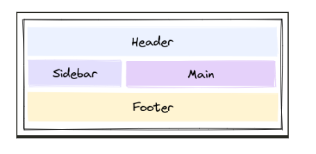
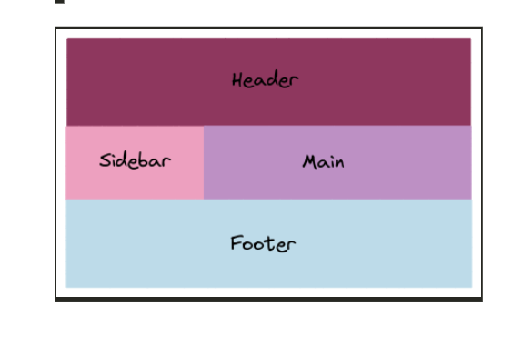
- Also, think of a webpage and how there's usually a navigation bar, a sidebar, and the content in the middle. A CSS Grid helps achieve that sort of styling easily by dividing up the page into different sections where each element can take place in the specified section.
key aspects of the grid concept
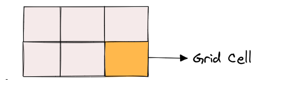
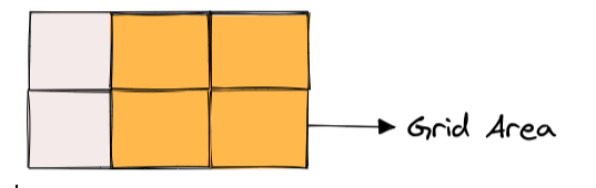
CSS Grid Properties
There are two main types of CSS Grid properties namely:
Parent properties (Grid Container)
Grid Container properties are used to define the layout of the grid container itself. These properties are applied to the parent element that contains the grid items. Some examples are:-
- Display: The display property is used to define the container element as a grid container. To use the display with CSS Grid, set the value to grid. This will turn the container element into a grid container, allowing you to use other grid properties to define the grid layout. -
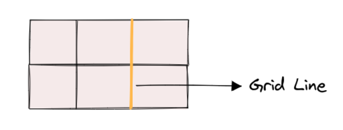
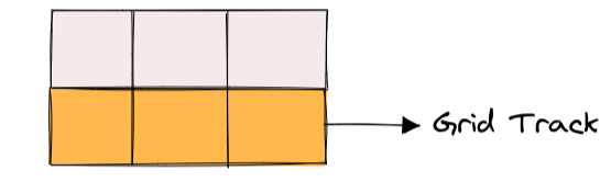
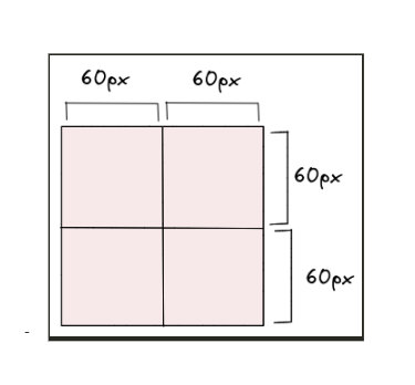
- grid-template-columns & grid-template-rows: grid-template-columns and grid-template-rows are used to define the size and position of columns and rows in a CSS grid. These properties allow you to create a flexible and responsive grid layout that can adjust to different screen sizes and content.
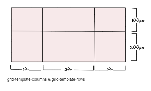
the values represent the track size, and the space between them is the grid line. We can then place elements inside the grid by using the grid-column and grid-row properties. - grid-template-areas: grid-template-areas allows you to define the layout of a grid by assigning names to areas within the grid. These names are used in the grid-area property to place items within the grid.
-
- grid-template: grid-template is a shorthand property in CSS Grid that allows you to define both the number and size of grid columns and rows in one declaration. -
- column-gap, row-gap column-gap and row-gap define the space between columns and rows, respectively. We have a grid container with three columns and two rows.
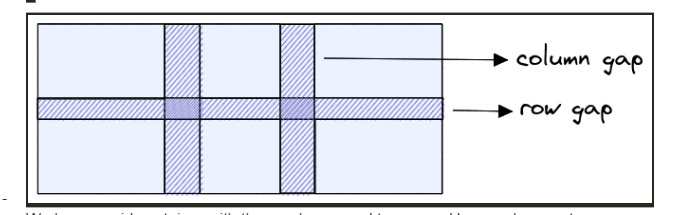
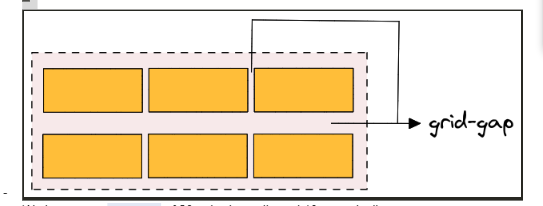
-grid-gap grid-gap is a shorthand property in CSS grid layout that allows you to specify the gap between grid columns and rows at the same time.
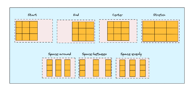
- justify-items justify-items is a CSS Grid property that defines how the grid items are aligned along the main axis (the horizontal axis) within their grid container. It is used to control the positioning of items in the grid container when there is extra space available in the main-axis direction.
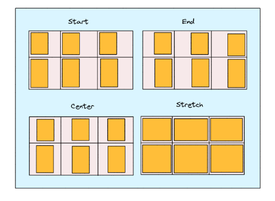
Here are the possible values for justify-items in CSS Grid:
- stretch (default): This value stretches the grid items to fill the available space along the main-axis.
- start: This value aligns the grid items along the start edge of the grid container in the main-axis direction.
- end: This value aligns the grid items along the end edge of the grid container in the main-axis direction.
- center: This value centers the grid items along the main axis of the grid container.
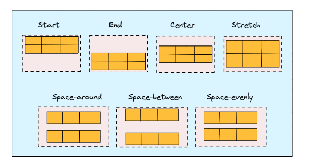
- align-items align-items defines how the grid items are aligned along the cross-axis (the vertical axis) within their grid container. It is used to control the positioning of items in the grid container when there is extra space available in the cross-axis direction.
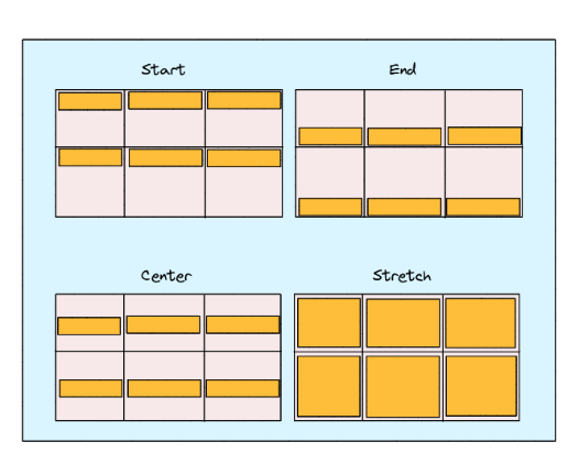 Here are the possible values for align-items in CSS Grid:
-stretch (default): This value stretches the grid items to fill the available space along the cross-axis.
-start: This value aligns the grid items along the start edge of the grid container in the cross-axis direction.
- end: This value aligns the grid items along the end edge of the grid container in the cross-axis direction.
-center: This value centers the grid items along the cross-axis of the grid container.-place-items place-items is a shorthand CSS Grid property that combines the align-items and justify-items properties into a single declaration. It is used to set both the horizontal and vertical alignment of grid items within their grid container. The possible value for place-items in CSS Grid is:: - justify-content justify-content defines how the grid items are aligned along the main axis (the horizontal axis) within their grid container. It is used to control the positioning of the grid container along the main axis when extra space is available in that direction.
 Here are the possible values for justify-content in CSS Grid:
- start (default): This value aligns the grid container along the start edge of the main axis.
- end: This value aligns the grid container along the end edge of the main axis.
- center: This value centers the grid container along the main axis.
- space-between: This value evenly distributes the grid items along the main axis, with the first item at the start edge and the last item at the end edge.
- space-around: This value evenly distributes the grid items along the main axis, with equal space between each item and half that space at the start and end edges.
- space-evenly: This value evenly distributes the grid items along the main axis, with equal space between each item and at the start and end edges.- align-content align-content is a CSS Grid property that defines how the grid items are aligned along the cross-axis (the vertical axis) within their grid container. It is used to control the positioning of the grid container itself along the cross-axis when there is extra space available in that direction.
 Here are the possible values for align-content in CSS Grid:
- stretch (default): stretches the grid items to fill the available space along the cross-axis.
- start: aligns the grid container along the start edge of the cross-axis.
- end: aligns the grid container along the end edge of the cross-axis.
- center: centers the grid container along the cross-axis.
- space-between: evenly distributes the grid items along the cross-axis, with the first item at the start edge and the last item at the end edge.
- space-around: evenly distributes the grid items along the cross-axis, with equal space between each item and half that space at the start and end edges.
- space-evenly: evenly distributes the grid items along the cross-axis, with equal space between each item and at the start and end edges.
-place-content The place-content property in CSS grid allows you to align and justify grid items along both the horizontal and vertical axes.- grid-auto-columns & grid-auto-rows grid-auto-columns and grid-auto-rows are properties that allow you to define the size of rows and columns that are created automatically to fill the grid container. These properties come into play when there are more grid items than cells in the explicit grid, which means that some cells are created automatically to accommodate the additional items.
-grid-auto-flow It specifies how the grid container should automatically place grid items that don't have a specific grid position set.The possible values for grid-auto-flow are
- row: This is the default value, and it means that the auto-placement algorithm should place items in rows, filling up each row before moving on to the next one.
- column: This value specifies that the auto-placement algorithm should place items in columns, filling up each column before moving on to the next one.
- dense: This value tells the auto-placement algorithm to try to fill in any empty cells as it goes along, rather than leaving them empty and moving on to the next row or column. This can result in items being placed in unexpected locations, but it can also help to fill the grid more efficiently.
-grid The grid property is the shorthand for setting all of the below properties in a single declaration.
- grid-template-rows
- grid-template-columns
- grid-template-areas
- grid-auto-rows
- grid-auto-columns
- grid-auto-flow
Child Properties (Grid Items)
Child properties are the CSS properties applied to the individual child elements of grid items. They are: grid-column-start,
grid-column-end, grid-row-start, and grid-row-end, Grid-column and grid-row, grid-area, justify-self, align-self, and place-self
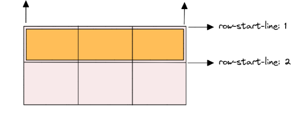
The properties grid-column-start, grid-column-end, grid-row-start, and grid-row-end are used to specify the location of a grid item
within the grid container.
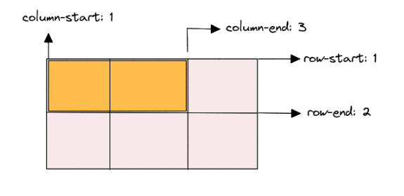
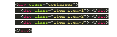
The grid-column-start and grid-column-end properties are used to specify the start and end positions of the grid item along the
horizontal axis (columns). For example, the grid-column-start value of 1 and grid-column-end value of 3 for the .item-1 class
specifies that the grid item should start at column 1 and end at column 3. Similarly, the grid-row-start and grid-row-end properties
are used to specify the start and end positions of the grid item along the vertical axis (rows). For example, the grid-row-start
value of 1 and grid-row-end value of 2 for the .item-1 class specifies that the grid item should start at row 1 and end at row 2.
The grid-column and grid-row properties specify a grid item's location within a grid container. When using these properties on a
child grid item, you can define the starting and ending grid lines on the horizontal (for grid-column) and vertical (for grid-row)
axes to determine the position and size of the item in the grid. You can adjust the values of grid-column and grid-row to position
your grid items as desired within the grid container.
 To use grid-area, you need to follow these steps:
Define the grid layout on the parent container using the grid-template-areas, grid-template-rows, and grid-template-columns properties.
Assign a name to each grid area using the grid-area property on the child items. The name should correspond to the name you
defined in the grid-template-areas property.
Set the position and size of the grid item using the grid-row-start, grid-row-end, grid-column-start, and grid-column-end properties.
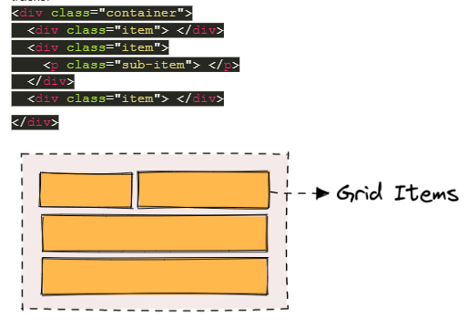
image
In this example, we have a container with a grid layout that defines three rows and two columns, and three named grid areas.
Each child item is assigned to a grid area using the grid-area property, and its position and size are set using the grid-row-start,
grid-row-end, grid-column-start, and grid-column-end properties.
using display: flex, justify-content, and align-items. The justify-self, align-self, and place-self properties are then used to control the alignment of individual items within their cells. The first item is aligned to the start of its cell horizontally using justify-self: start. The second item is aligned to the end of its cell vertically using align-self: end. The third item is centered both horizontally and vertically using place-self: center stretch, which sets the horizontal alignment to center and the vertical alignment to stretch.
Tricks while using CSS Grids
To create more flexible and maintainable CSS grids, you can use these tricks to simplify your code.
- Use the repeat() function to simplify grid templates: example; Instead of this grid-template-columns: 1fr 1fr 1fr 1fr 1fr;
Use the repeat() function for cleaner code grid-template-columns: repeat(5, 1fr);
- Use auto-fit or auto-fill to create flexible grids: example; This grid will automatically create as many columns as will fit in the container
grid-template-columns: repeat(auto-fit, minmax(250px, 1fr)); . This grid will always create 3 columns, and will fill any extra space
with empty cells grid-template-columns: repeat(auto-fill, minmax(250px, 1fr));
- Use grid-gap to add spacing between grid items: example; This grid will have a 20px gap between grid items
grid-gap: 20px;
- Use grid-template-areas to create named grid areas
- Creating a responsive grid with media queries
- Nesting grids for more complex layouts
To conclude, it is important to understand the basic principles of grids and practice working with them. Start by experimenting
with simple grid structures and gradually explore more complex layouts. Familiarize yourself with CSS grid systems and frameworks
that provide ready-to-use grid structures, making it easier to implement grids in your designs. Remember, the grid concept is a
powerful tool that can greatly enhance your web design skills. Embrace its structure, experiment with different layouts, and enjoy
the creative possibilities it offers.